05 / 06packaging

The Better Made

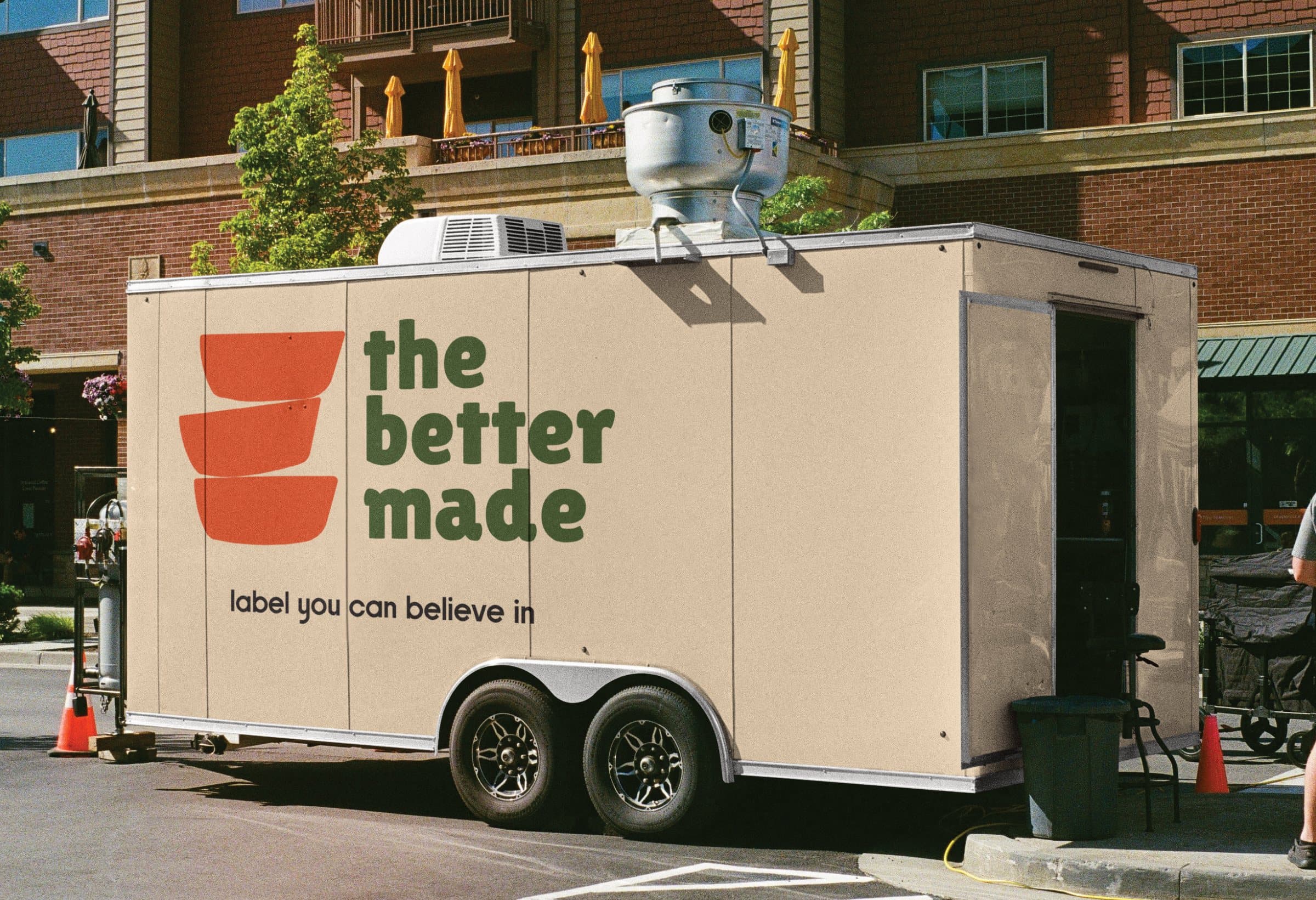
A beige food trailer carrying the Better Made logo and the line “label you can believe in”, parked outside a brick building
A green awning with the Better Made logomark in white

About Better Made

BetterMade is an organic oats brand built around making breakfast simple, wholesome, and convenient. I developed its brand identity, packaging, and visual language, creating a clean and approachable system that reflects its promise of better ingredients and better mornings.
The Better Made logo, three stacked orange bowls beside the wordmark in green, on peach
The Better Made logomark, three stacked bowls, in orange on peach

LOGO

LOGOMARK

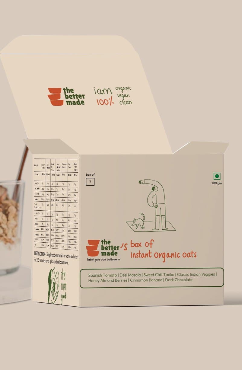
An open Better Made box of instant organic oats, with a line drawing on its side

THOUGHT BEHIND THE LOGO

Rounded forms and bold typography create a friendly, accessible personality.

The stacked bowl-like forms visually reinforce the idea of making something better, layer by layer.
The Better Made logo in black

The chunky, rounded letterforms give the typography a warm and approachable feel.
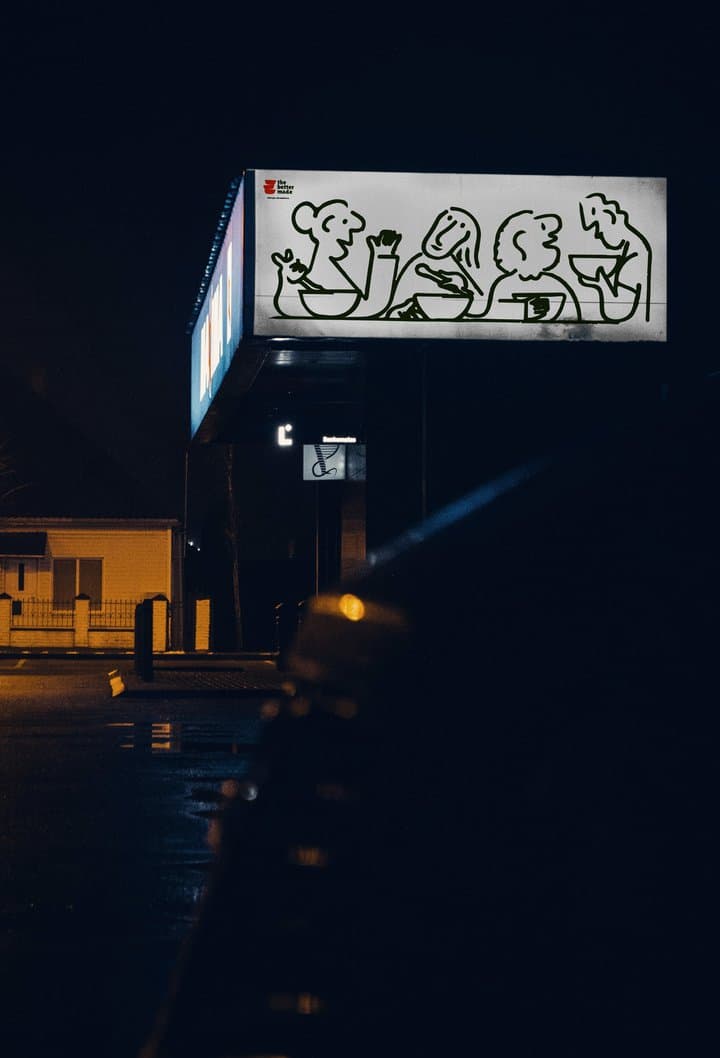
A lit sign of line-drawn figures over a shopfront at night

COLOR

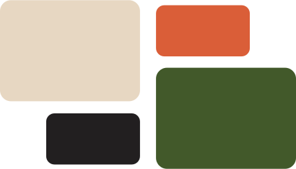
The colour palette: sand, orange, green and black swatches

TYPOGRAPHY

Primary font Lilita One Secondary font Forta

label you can believe in

THOUGHT BEHIND THE PACKAGING AND BRANDING
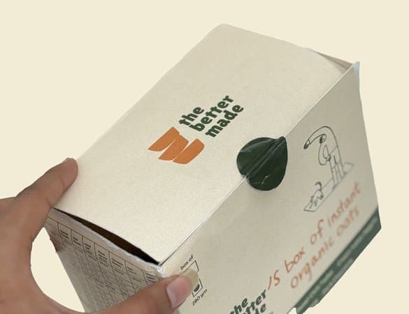
A hand holding the closed box, its lid fastened with a green tab
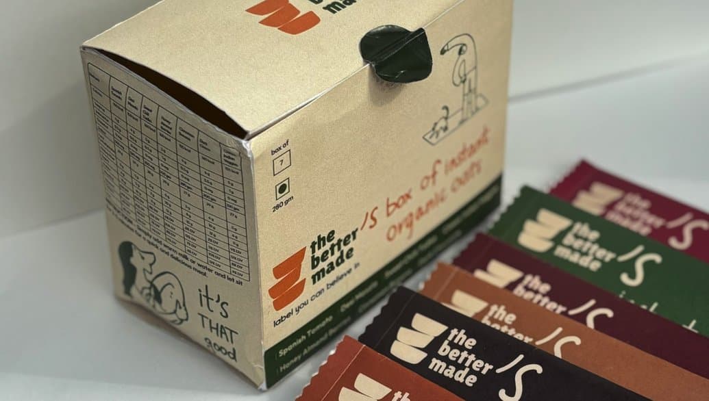
The box of instant organic oats beside a spread of sachets
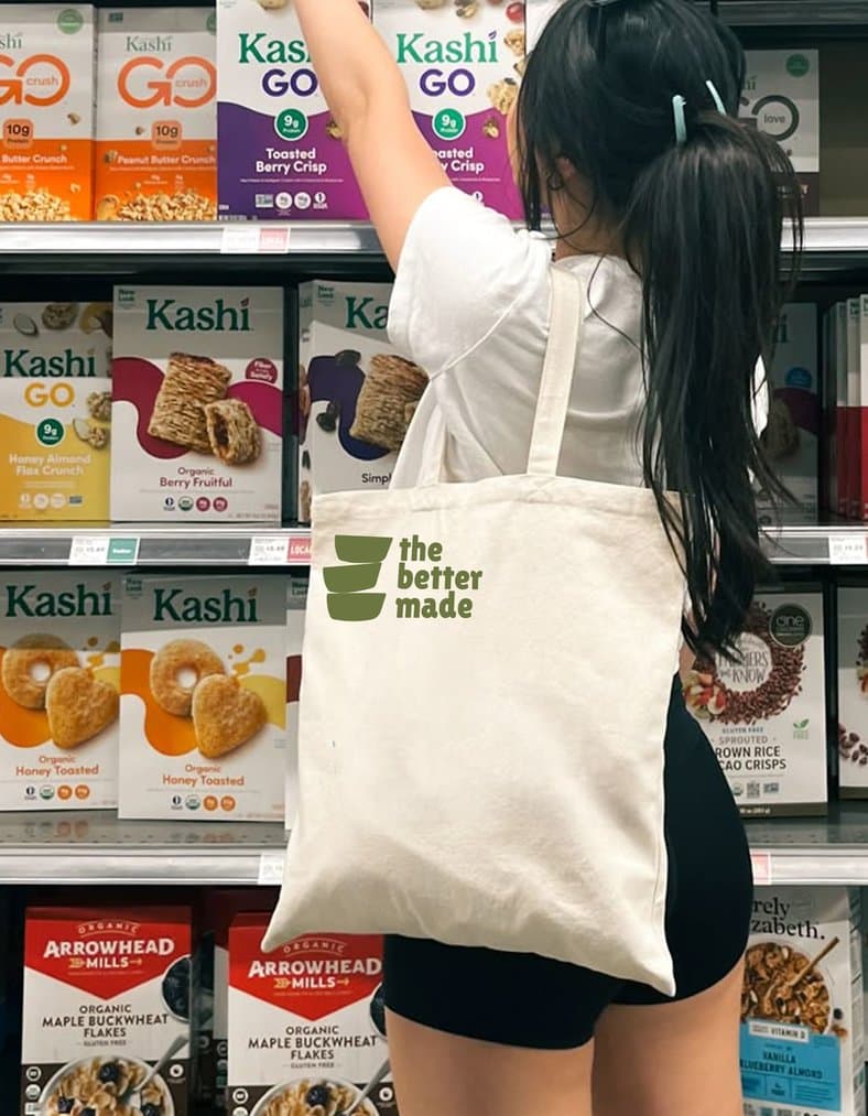
A woman carrying a Better Made tote reaches for a box on a cereal aisle shelf
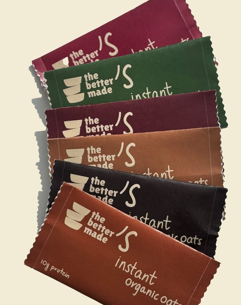
Sachets of instant organic oats fanned out, from maroon and green to brown and rust

INSTANT FRESH ON THE GO

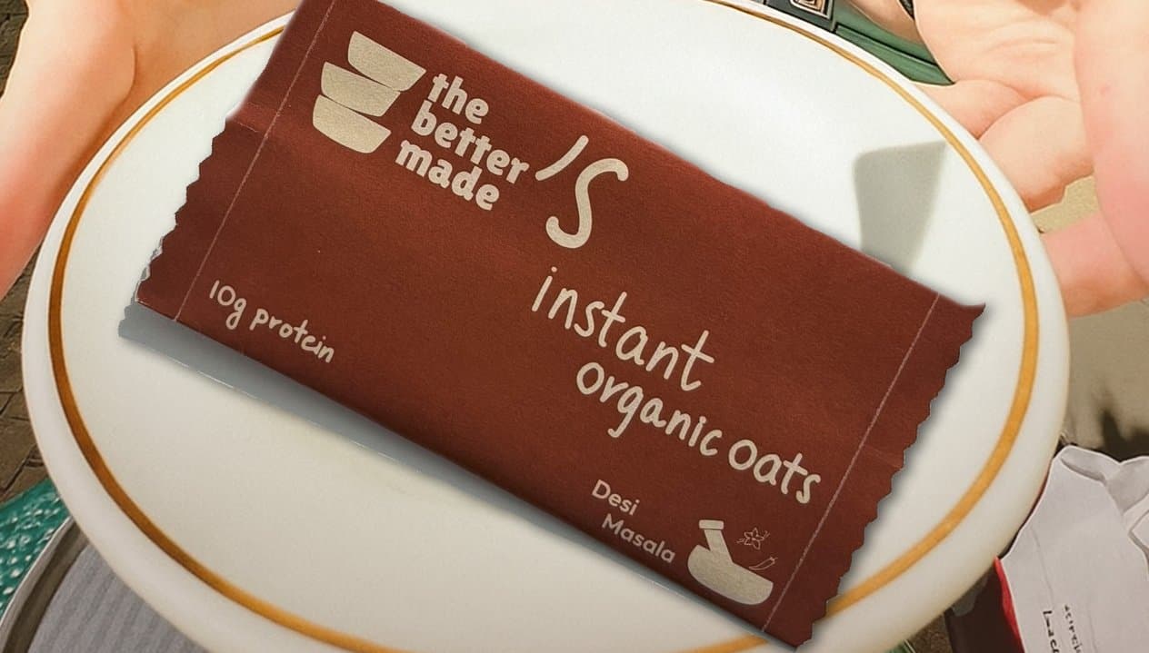
A rust sachet of instant organic oats on a gold-rimmed plate
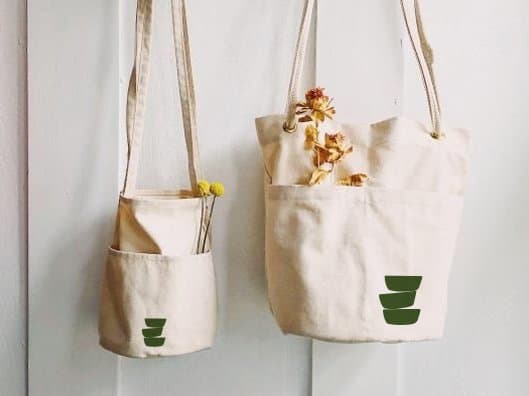
Two canvas bags printed with the logomark, hung on a white wall with dried flowers
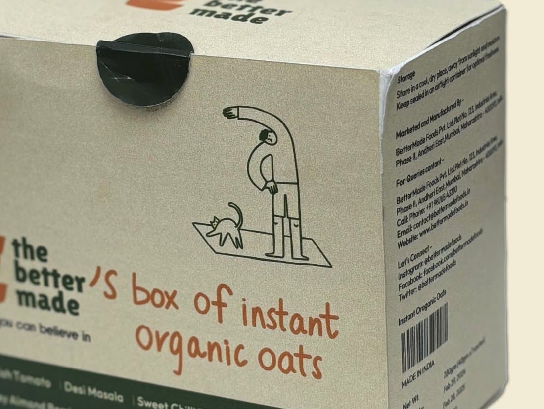
The side of the box: a line-drawn figure walking a cat, and “the better made’s box of instant organic oats”
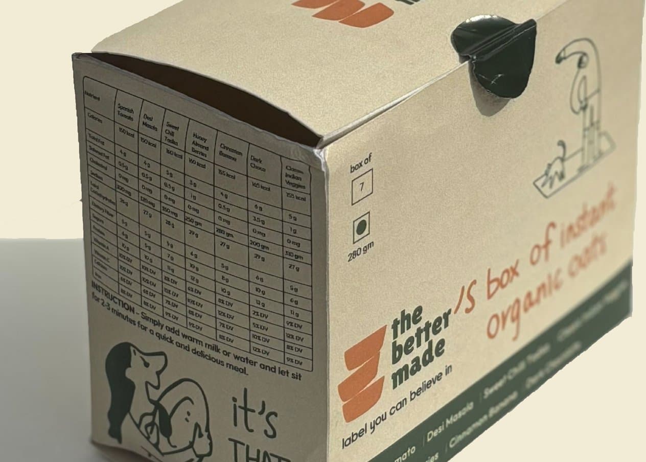
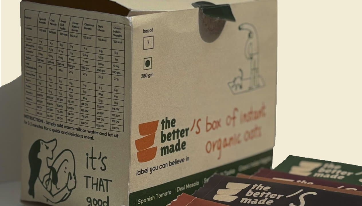
The box turned to show its nutrition table and the line “it’s THAT good”
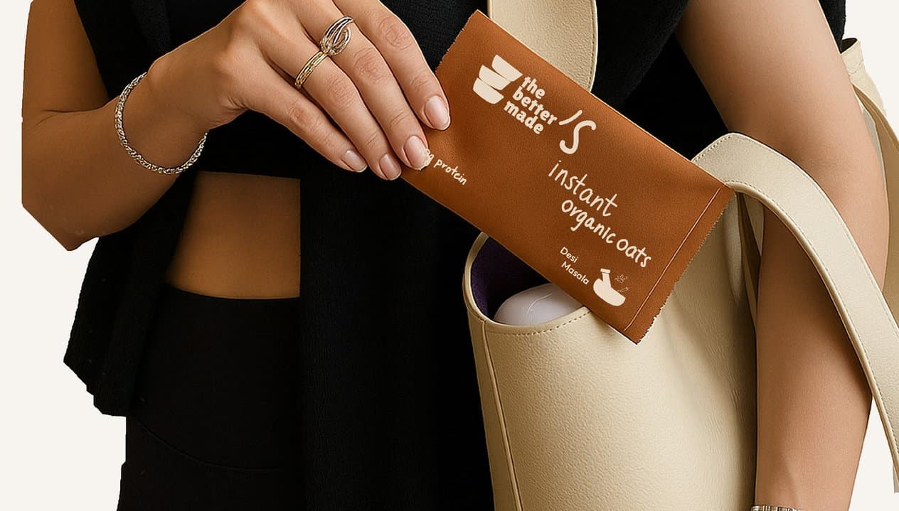
Hands slipping a sachet of instant organic oats into a cream shoulder bag
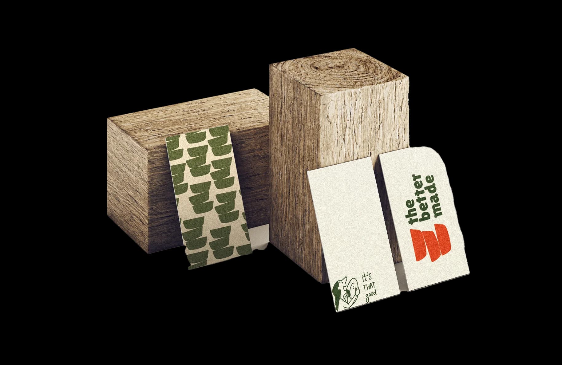
Wooden blocks with a wrap in the logomark pattern, and two tags carrying the logo and “it’s THAT good”
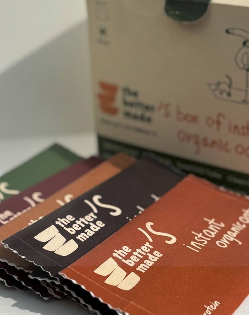
Sachets in maroon, brown and rust fanned out in front of the box
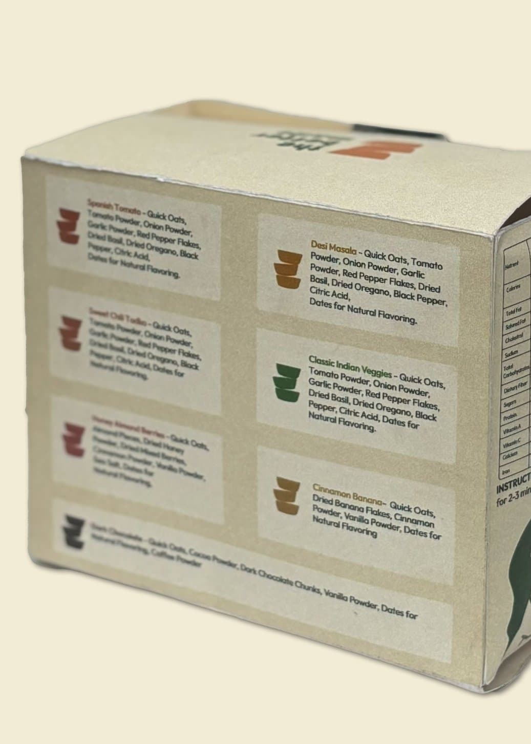
The back of the box, listing what goes into each of its seven flavours

With seven different flavours
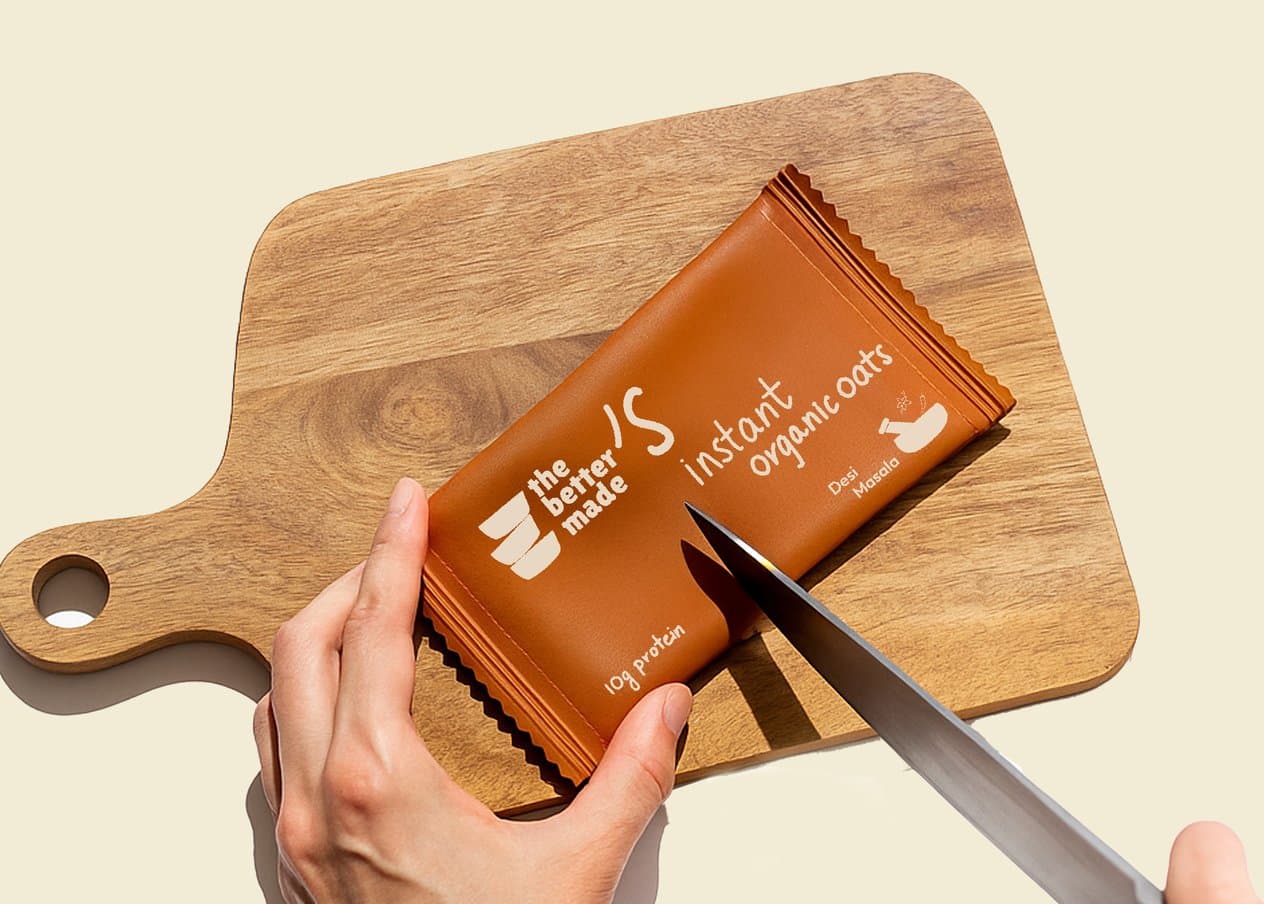
A hand cutting open a sachet on a wooden board
The box with sachets beside it, its front reading “it’s THAT good”
next project06 / 06

Editorial, after The Better Made